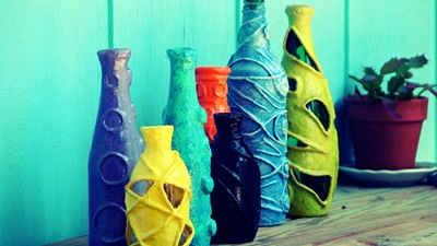
There is something about the looming summer, directly in front of us, that has Jeff wanting bright, dramatic color. And it shows in some in a new collection of bottles he’s been working on. (above are works in progress)
Our home is painted in a lot of green---inside and out. To us, green is a neutral color and blends our home in so well with its surroundings. We like it like that.
Recently, though, Jeff started talking about painting a small portion of the exterior walls of the house where we have a balcony---and wanted something wildly, different.
He got what he wanted.
Originally, I had picked out the same colors but much more muted. Not outrageous enough, Jeff thought, and went and picked out these colors. (hmmmph … he seemed unusually adamant about it. As a rule, I’m the color picker.) I let him have his way, hoping that in a few weeks time I’d be used to the color. I painted it for him on Memorial Day weekend and it has already grown on me.
It’s a very private balcony. Our neighbors can’t see it. We can barely see it from the backyard. But while we’re up there, kicking back in the early evening, and the sun is setting, we feel like we’re in Key West.
Choosing a color palette is always a little intimidating for me. One thing I do that makes it easier, and what an art teacher from high school taught me, is to pick one color (that’s usually easy) then pick it’s complementary color (the one that is directly across from it on the color wheel) then pick the next color on either side of the complementary color. Using these three colors as my base, I add shades and tints of the colors to create a palette. My teacher said this is how palettes were picked in Art Nouveau. However, after studying images from the art nouveau era, I haven’t found this to be completely accurate. Even so, I find that when I follow these steps I end up with a pretty pleasing palette.
If you would like to learn more about what makes a great palette or get intimidated by creating one, there are some social websites full of people that are really good at it. They have palettes to browse and inspire, and tools to help create your own…
ColourLovers – “Share Your Color Ideas & Inspiration. ColourLovers is a creative community where people from around the world create and share colors, palettes and patterns, discuss the latest trends and explore colorful articles... All in the spirit of love.”
Kuler – “the web-hosted application for generating color themes that can inspire any project. No matter what you're creating, with Kuler you can experiment quickly with color variations and browse thousands of themes from the Kuler community… available online at no charge
beginnings of our new summer shades collection…


I know it’s not warming up all over the planet; I imagine many of you are bracing for the cold and wintry changes. I wonder if a chilly outlook changes your palettes.
Cheers, to all, regardless of your thermostat readings,
~dale


i love the yellow door! thanks for the palette tips!
ReplyDeleteI absolutely love the colours of the bottles. The vibrant colours make them pop and really giving a relaxing and refreshing feel to them!
ReplyDeleteOh, I love all things colour!
ReplyDeleteHere's a link to some colour and pattern tools that I find really useful: http://www.colourlovers.com/tools
It's funny how sometimes bright and bold colors are what's refreshing to us, while other times we just want to be surrounded in calm and cool hues.
ReplyDeleteI'm really liking the colourlovers website!
High five for using such bold color! Your photos are looking really lovely
ReplyDelete